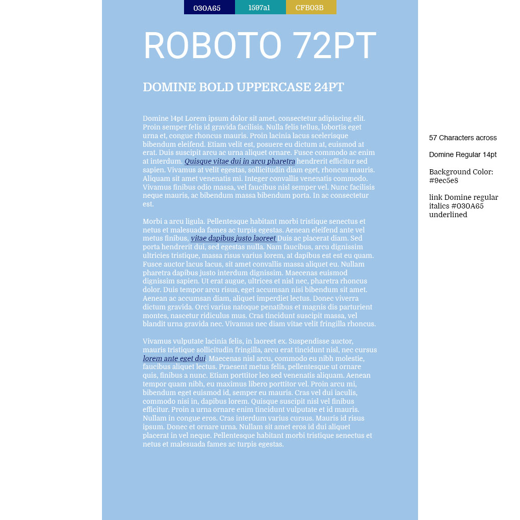
The reason I picked the steel sky blue color is because when I think "travel"
I think of planes in the sky and its a nice welcoming color. The dark blue I
picked because it reminds me of the oceon but also could be used for the
color of the links and make them more visible. The teal color also gave me
the feel of clear teal water that would be featured in a travel magazine along
side the gold yellow color for beautiful sand. I think the colors all have a nice
blend. I picked those two Fonts Roboto and Domine because the Roboto i can
see you writing a country name clearly and big and the Domine Font looks
like text from travel magazines that ive seen.