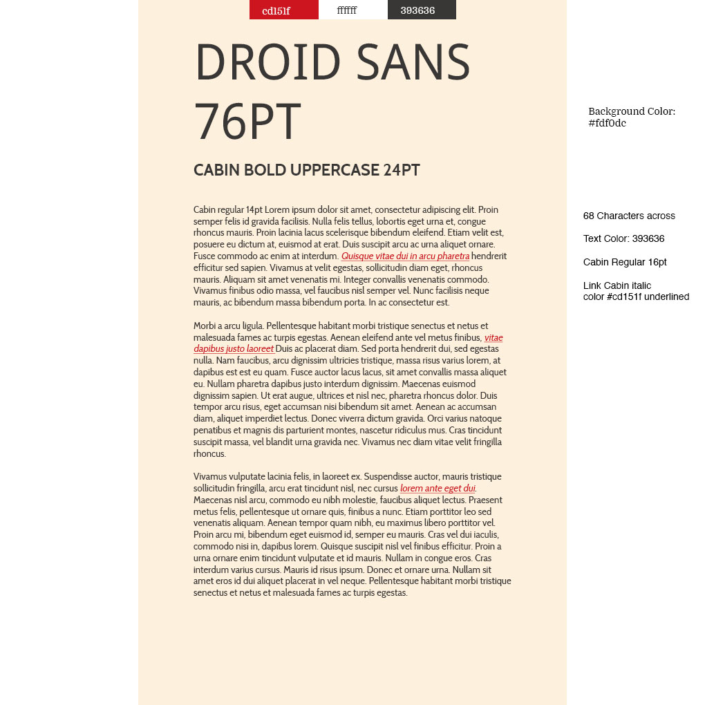
I picked the light tan color because it kinda reminds me old
school paper in journals and it looks good for a school
magazine idea to kinda create that illusion of it being out so
long that it makes you think its reliable but the color is also
very nice and welcoming as well. I picked the red color
because i imagine headlines backgrounds in red. i Also picked
a light black color because it looks a little nicer than the
complete black text and makes it look a liitle more unique. The
white color i can see being the main background color of the
school paper and the light tan can make it easier to see content.
The Font i chose for the header was Droid Sans because it's
Clear when it's big and has a hint of the past that i really
like and think readers would feel nostalgic to. While the second
font i chose is perfectly clear and also has a nice old school feel
to it but its still very easy to read.